Many thanks to JetPens for sponsoring the purchase of the pen reviewed here. There are no affiliate links in this post and I was not monetarily compensated. This review reflects my opinions and experiences with the pen.

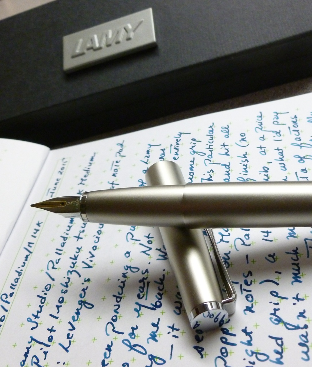
Lamy Logo, Brushed Finish (The box swings open on a hinge…kind of cool.)
A confession. I’m not feeling particularly Christmasy this year— not yet, anyway. I don’t know what’s up, but I’ve been battling a low-grade crabby/tired/overwhelmed feeling that doesn’t exactly make one spill over with good cheer. I suspect it’ll pass when I get some good sleep, wrap up my Christmas errands, and walk away from work until January 2nd. I think I need to flop into a big soft chair, read a book, or watch “It’s a Wonderful Life.” That should do it.

But I need to chill out in the meantime. One way to take the edge off— other than a good stiff cocktail (yum)— is to sit down with pen, paper, and ink— some VIBRANT ink. The days have been relentlessly flannel gray, which could easily explain why I’ve been moody and craving this Lamy turquoise. I popped the cartridge into my new Lamy Logo, started writing nonsense, and felt my blood pressure drop at least a couple of points and my mood begin to lighten. At $45 (+ ink), it’s cheaper than therapy!

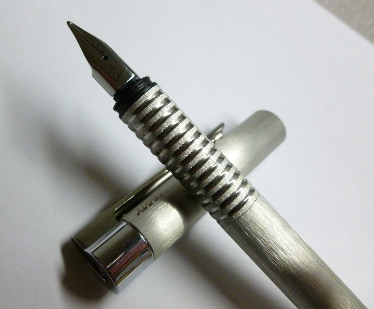
Ribbed grip
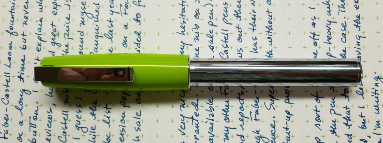
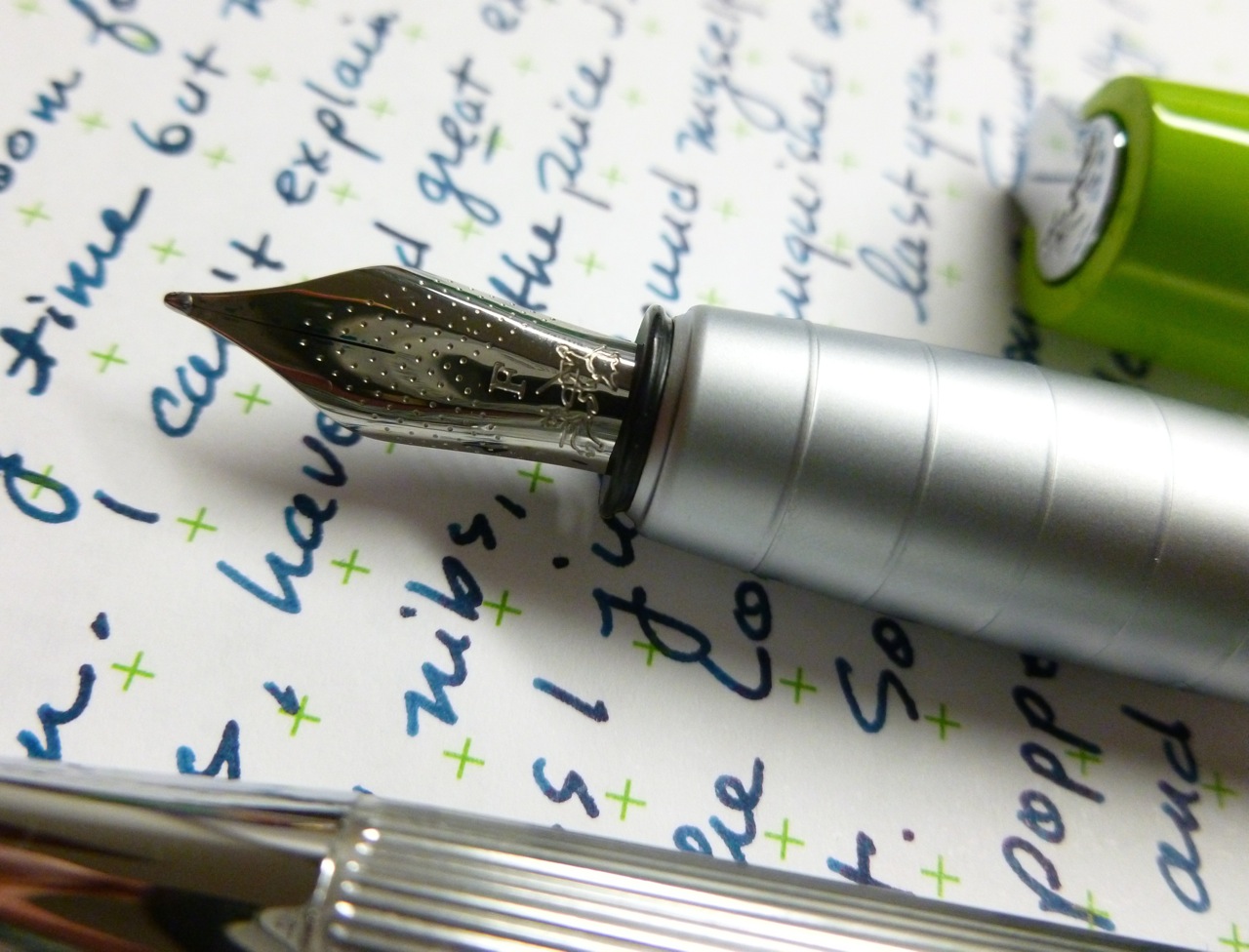
The Lamy Logo is a pen I only recently noticed. It’s slim and trim, and the brushed stainless steel finish is both muted and shiny at the same time. The narrow 0.4″ (9.7mm) grip is somewhat pencil-like in thickness, and is a good Lamy option for those annoyed by the molded triangular grip on the Lamy Safari and AL-Star models. Featuring a ribbed grip, spring-loaded clip, understated branding, and swappable nibs, this is another economical Lamy pen to consider, especially if you’re not ready to go “all in” on the Lamy 2000.

Spring-loaded clip

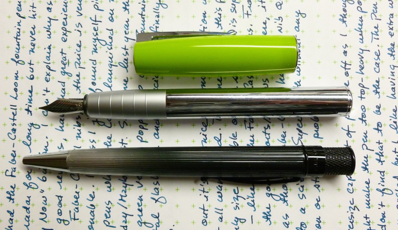
Size comparison: Capped

Size comparison: Posted

Size comparison: Unposted
Unposted, the pen feels a little short (at 4.6″ or 11.7 cm), though it really isn’t. When posted, the pen measures 6.4″ (16.2 cm), which looks long, but actually feels fine. It’s a light pen (19.8 g capped, 13.5 g uncapped), but posting the cap doesn’t seem to throw off the balance. I usually use the pen posted.

The ribbed grip definitely keeps the pen from feeling slippery. I’m guessing, though, that those ribs might be a bit of a nuisance when dipping the section into an ink bottle to fill the pen as they’re bound to trap some ink. I haven’t used the Z26 converter yet (not included), opting, so far, to use Lamy cartridges. When I do use a converter, I might fill it directly from the bottle then pop it into the pen, much like installing a cartridge, to avoid having to clean ink off of the grooved section.
The snap cap fits on the pen in such a way that a portion of the grip area remains revealed, which adds some visual interest to the matte stainless body. The cap fits tightly so it takes a good yank to remove it. It’s definitely going to stay put.

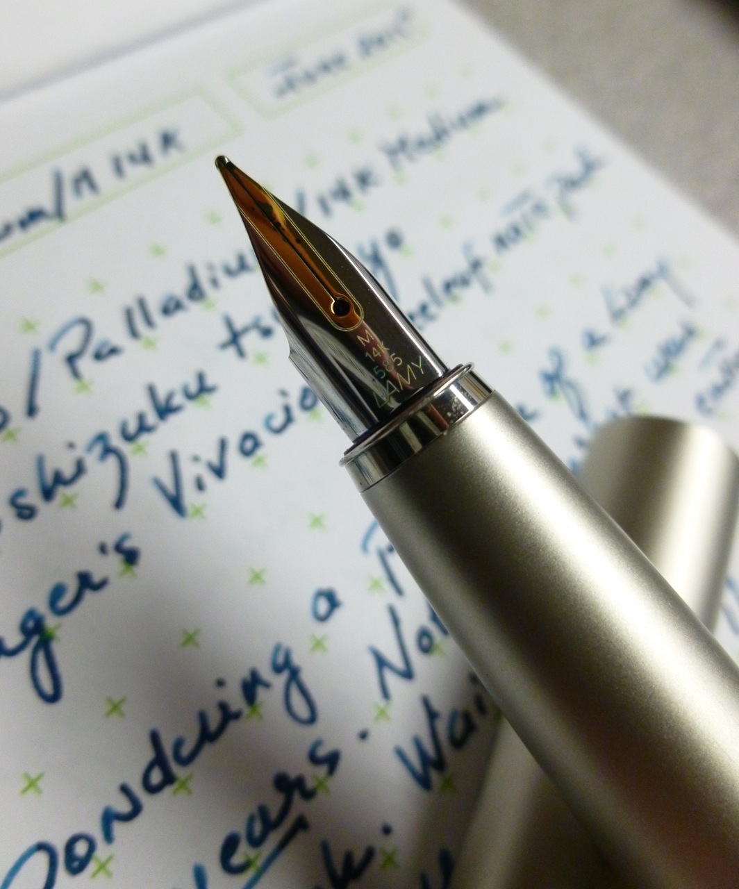
This medium nib is VERY smooth— quite stiff, but a pleasure to write with. There’ve been no hard starts, skips, or faltering of any kind. I popped in the turquoise cartridge and the ink flowed after just a couple of scribbles. Flow is excellent— juicy, but not gushing. I’m really growing to love these wider Lamy nibs, especially on Tomoe River and Circa Vivacious paper.

This isn’t a particularly flashy pen, but it’s solid and good-looking— a step up (or step sideways) from the usual Lamy fare.

This slim and well-made pen, coupled with that Caribbean blue turquoise ink, can brighten an iffy mood. When I’m feeling out of sorts, I sit down at my desk, grab a sheet of paper and this pen, and say “Lamy, take me away!”

Ah, relief.
————–
Edited to add: This blog post from the Whole Life Challenge site is helping with that “Christmas spirit” thing. Worth a read.