It’s the Little Things

FDC73DC9-FF5D-4CA9-8C9E-FC45FA818687

Did I need another Lamy Safari? I did not. And yet I now have another Lamy Safari.

Despite what this sounds like—that I have no willpower when it comes to stationery purchases—I’ve actually been flexing my muscles of resistance quite regularly. Just lately I’ve taken a pass on Blackwing Volumes No. 10 (still available), Write Notepads extremely limited run of their “Fourth of July” pocket notebooks (sold out in a flash), a handful of small batch offerings from Karas Kustoms (some sold out, some still available), and the Graduate Hotels edition from Field Notes (which was a particularly tough one since I work at a college and love the academic vibe).

Rest assured, I’m no saint. I’ll soon be placing an order for Lemur Ink’s new Blackstone Lemur Lime and J. Herbin’s Kyanite du Népal. I do not need more ink and yet I’ll soon have two more bottles.

But back to that Lamy Safari. The red clip and red finial got me. Those seemingly small details are what, for me, flipped the switch from “I’ll (begrudgingly) pass” to instabuy.

IMG_0438

Like the Lamy Safaris, I certainly don’t need any more pencils but who can resist that Swiss cross on the red dipped Caran d’Ache Swiss Wood pencils? If you were here with me, you’d notice that I’m not raising my hand. I absolutely LOVE that detail.

So while I’m trying to be much more discerning in what I buy—by sitting on purchase decisions for a few days or longer, by trying to figure out exactly WHY I want the object of my desire, by looking at the stationery stash that already occupies a chunk of my dining room—there will be those items that speak to me. There will be a tiny detail that lights a little fire of happiness and makes me smile, even on a tough day. Who can say no to that?

Classic and Classy: Sheaffer’s Sagaris Rollerball

The folks at Sheaffer provided me with this Sagaris Rollerball pen for review purposes. I was not otherwise compensated, and the review reflects my own experiences and observations.

Sheaffer Sagaris Rollerball
Sheaffer Sagaris

I get a nostalgic feeling when I think about the Sheaffer brand. I was a bit (maybe more?) of an oddball kid and was particular about my pens and pencils as early as junior high school. We regularly bought our school supplies at Woolworth’s— usually the garden variety stuff that suffered from iffy performance. Somehow I got my hands on a yellow Sheaffer NoNonsense ballpoint pen, and that became my pen of choice for years. I remember bugging my father to bring home new refills from the swanky luggage/jewelry/pen store near his downtown office. Ah, memories.

Sheaffer Sagaris
Brushed chrome with chrome trim

Fast forward a number of decades, and my collection is starting to reflect that early Sheaffer love. I picked up the Taranis fountain pen at the DC show and LOVE that thing. This year I also acquired a vintage Sheaffer Lady Balance, as well as a stainless steel NoNonsense fountain pen that reminds me of my junior high pen. Sheaffer’s been around for 101 years and I’ve been a fan for…well…a healthy percentage of those years.

Sagaris branding

The branding on the Sagaris is subtle. “SHEAFFER” is engraved on both sides of the polished chrome center band, and the pen’s clip sports Sheaffer’s white dot of quality. Both ends of the pen are polished to a mirror finish which provides just the right amount of visual interest.

P1030187

P1030185

The cap sports a nicely springy clip and snaps onto the body in a substantial way. I think the flared part of the plastic section is what makes the cap seat so tightly. That part of the section is my one bugaboo with the pen. It’s not exactly in my way, but I find that I notice it when I grip the pen. It’s sort of in the sweet spot of my grip, but doesn’t really cause a problem when I write. It’s just there. I rest my forefinger on it and I’m off and running.

Sagaris section

The Sagaris takes the Sheaffer Slim Rollerball refill which is very smooth, dark, and consistent. This is a liquid ink, so much like a fountain pen, the performance of the refill will vary depending on the paper used. The rough draft of this review was written on Rhodia paper and lookes great. I’ve also had very good performance from the refill on plain old copier paper. But be aware that, unlike gel ink, rollerball ink may feather on some papers.

My only other complaint is that the Sheaffer refills are available only in blue and black and in a medium width. Personally, I’d prefer a finer option. Poking around a bit for other refill options, I found that Levenger sells a compatible 0.5 mm rollerball refill in black, blue, and red. I’m planning to spring for a pack of these to give myself the option of going finer.

Size comparison
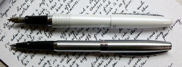
Size comparison: Sheaffer Sagaris rollerball vs. Pilot Metropolitan fountain pen

The Sagaris has a nice weight but is not heavy. I generally use the pen with the cap posted and find that this feels nicely balanced in hand.

Sheaffer Sagaris

Packaged in a gift-worthy box, the Sheaffer Sagaris rollerball sports clean good looks. Available in seven finishes, there’s a look to please just about anyone. The Sagaris line also includes ballpoint and fountain pens, so there are plenty of options to choose from. The look is classic and classy— perfect for home, office, or school.

Sheaffer Sagaris

The Sagaris line carries on Sheaffers’s tradition of quality that hooked me as seventh grader and keeps me coming back for more. You can’t argue with that kind of history.

Hmmm…I wonder if I can still get my father to spring for those refills.

Mildred’s Pen: Sheaffer Lady Balance (Marine Green Striated)

Sheafffer Lady Balance

This Sheaffer Balance is another vintage pen that I picked up from Dan Smith, my go-to vintage pen supplier of late. As I’ve said, I’m a total novice when it comes to vintage pens, but I liked the look of the marine green striated celluloid and I trust Dan, so I happily plunked down a little bit of money for this Lady Balance.  I don’t have many green pens, so that might be what caught my eye initially, but what really tugged at me was the engraved name on the barrel— MILDRED F THAYER.

Mildred F Thayer

Though we all know that vintage pens once belonged to someone else, I apparently have a soft spot for pens where the original owner is named. Especially if the name is as “vintage” as the pen. I mean, how many babies named “Mildred” do you run into these days?

Striated Celluloid & Clip

The pen arrived in very good condition (to my eye), and the green striated celluloid looks as good in person as it does in Dan’s photos. It’s a petite thing— measuring 4.75″ capped and 5.78″ posted—and weighs a mere 12.2 g, thus the “Lady” designation.  Dan noted in his description that there’s a small amount of wear on each side of the ball at the end of the clip, but to the naked eye that’s not visible. For being 70-ish years old, it’s in great shape, with a crisp SHEAFFER imprint and an easy-to-read engraving of Mildred’s name.

Sheaffer imprint

The Sheaffer’s Feather Touch nib is very fine and was initially on a little on the dry side, just as Dan noted in his post. As I’ve been using it, though, it seems to be getting just a bit wetter, while still putting down an extra-fine line. Despite its fineness, the nib is quite smooth, with just a hint of feedback— very  pleasant. Dan was able to coax some flex from the nib, but I haven’t been able to do that as yet— which I’m sure is more a reflection of me and my light touch than the nib.

Feather Touch Nib

The blind-cap reveals a narrow piston which I’ve used to vacuum fill the pen with Montblanc’s Jonathan Swift Seaweed Green— a very dusty/vintage looking green that I initially wasn’t all that crazy about. But as I hoped, it’s a perfect match for the pen. I mean, c’mon— seaweed colored ink in a marine green pen. And over time, I’ve come to love the ink as much as the pen. It’s a muted, antiquey green— not a screaming green— which matches my personality and the way I use my pens.

Blind cap & piston

So those are the pen’s details, but back to Mildred. Where did she live? What did she do? Who gave her this pen? I googled her name and found a 12-year old Mildred F Thayer in the 1940 census who lived in Petersburg, Virginia with her father (William), mother (Janie), one sister, and three brothers. Is this MY Mildred? I’ll never know. And I’ll never know if she used the pen to do school work or office work; if she used it to write grocery lists, letters, journal entries, or poems. If only the pen could talk. If only it could tell Mildred’s story.

Sheaffer Balance

But since that’s not possible, I’ll use Mildred’s pen to tell mine.

Wow: Sheaffer Taranis (Sleek Chrome) Fountain Pen

Sheaffer Taranis (Sleek Chrome)

Coincidentally, as I sat down to handwrite the rough draft of this review- for the pen named after the Celtic God of Thunder- a fierce thunderstorm rolled through our area. The power flickered, a huge chunk of our neighbors’ tree toppled into their yard, thunder growled and cracked, and jagged lightning lit the prematurely dark sky. This storm was a DOOZY, and I loved every minute of it.

Thunderstorm!photo-2

But there are those who beg to differ- like my neighbors with the tree damage. And the same appears to be true when it comes to the looks of the Sheaffer Taranis. I read a number of reviews before picking up this pen from the Andersons at the DC Pen Show and found that the opinions run hot and cold. You either love it or hate it. I happen to fall into the “love it” camp.

P1020603

One bone of contention is the over-sized clip. It IS a long one- almost as long as the cap- but that doesn’t bother me in the least. It’s pretty plain, does the job, and doesn’t visually detract from the sleek look of the pen. Others beg to differ.

P1020619

The distinctive metal-on-resin section draws strong opinions from both camps. Some call it ugly. Others call it attractive and innovative. Personally, I like the look (though the Sheaffer branding could have been toned down a bit), and I really like how it feels. My fingers naturally fall on either side of the low-profile metal SHEAFFER strip, and even seem to enhance my finger placement a bit. It’s nothing like the clip on the Pilot Vanishing Point which often feels like it’s in my way.

Underside of section

Note that the nib size is not found on the nib, but on the section’s “underbelly.” Took me awhile before I noticed that.

Squared end of the Taranis cap

The Taranis’s body and snap-on cap transition from the expected round pen shape to narrow squared off ends, which results in a uniquely sleek look.

Hooded nib

Yesterday’s storm made me say “Wow!” and that’s exactly what I said when I wrote a few lines with the tester pen at the Anderson’s booth in DC. The hooded, super-smooth steel nib absolutely sold me on this pen. Even in fine, the nib absolutely glides across my Rhodia dotPad without a hint of scratch. It’s pure pleasure to write with, and has been from day one. One thing to note, the Taranis requires Sheaffer’s proprietary cartridges and converter, and while not ideal, that’s not a deal-breaker for me.

At 35 grams, this pen is neither noticeably heavy nor light, and is very well-balanced. I’m as happy using it posted as I am unposted.

So, though others may disagree, I love my Sleek Chrome Taranis as much as I love thunderstorms. Undoubtedly because both make me say, “Wow!”

P1020630

Note: The ink used for this review is Pendleton Brown’s BLaKWa by Organics Studio. Paper is from a Rhodia dotPad No. 16.