Coincidentally, as I sat down to handwrite the rough draft of this review- for the pen named after the Celtic God of Thunder- a fierce thunderstorm rolled through our area. The power flickered, a huge chunk of our neighbors’ tree toppled into their yard, thunder growled and cracked, and jagged lightning lit the prematurely dark sky. This storm was a DOOZY, and I loved every minute of it.
But there are those who beg to differ- like my neighbors with the tree damage. And the same appears to be true when it comes to the looks of the Sheaffer Taranis. I read a number of reviews before picking up this pen from the Andersons at the DC Pen Show and found that the opinions run hot and cold. You either love it or hate it. I happen to fall into the “love it” camp.
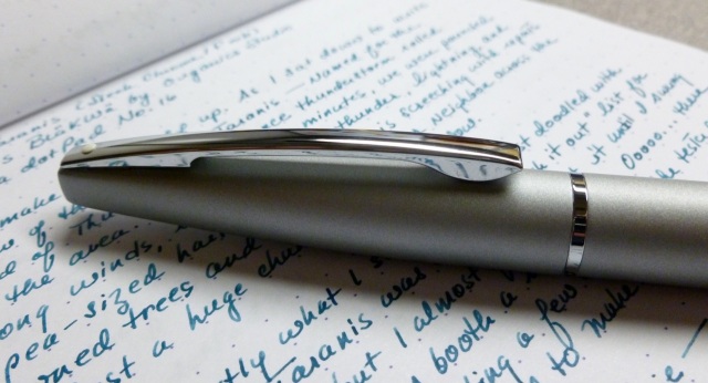
One bone of contention is the over-sized clip. It IS a long one- almost as long as the cap- but that doesn’t bother me in the least. It’s pretty plain, does the job, and doesn’t visually detract from the sleek look of the pen. Others beg to differ.
The distinctive metal-on-resin section draws strong opinions from both camps. Some call it ugly. Others call it attractive and innovative. Personally, I like the look (though the Sheaffer branding could have been toned down a bit), and I really like how it feels. My fingers naturally fall on either side of the low-profile metal SHEAFFER strip, and even seem to enhance my finger placement a bit. It’s nothing like the clip on the Pilot Vanishing Point which often feels like it’s in my way.
Note that the nib size is not found on the nib, but on the section’s “underbelly.” Took me awhile before I noticed that.
The Taranis’s body and snap-on cap transition from the expected round pen shape to narrow squared off ends, which results in a uniquely sleek look.
Yesterday’s storm made me say “Wow!” and that’s exactly what I said when I wrote a few lines with the tester pen at the Anderson’s booth in DC. The hooded, super-smooth steel nib absolutely sold me on this pen. Even in fine, the nib absolutely glides across my Rhodia dotPad without a hint of scratch. It’s pure pleasure to write with, and has been from day one. One thing to note, the Taranis requires Sheaffer’s proprietary cartridges and converter, and while not ideal, that’s not a deal-breaker for me.
At 35 grams, this pen is neither noticeably heavy nor light, and is very well-balanced. I’m as happy using it posted as I am unposted.
So, though others may disagree, I love my Sleek Chrome Taranis as much as I love thunderstorms. Undoubtedly because both make me say, “Wow!”
Note: The ink used for this review is Pendleton Brown’s BLaKWa by Organics Studio. Paper is from a Rhodia dotPad No. 16.


