Journaling with Iroshizuku ina-ho (“Rice Ear”)

We’re in that stage of fall here in upstate New York where the foliage is on its way to vibrant, and homes are decorated with pumpkins and richly colored mums, so I’ve followed suit by filling pens with inks in bright autumnal hues, which is to say I’ve got a lot of oranges going on right now.

This nearly full bottle of Pilot Iroshizuku ina-ho was included in the Week #38 bundle of ink that I unwrapped a couple of weekends ago. I’m typically inking my pens with heavily saturated colors and ina-ho is certainly not that. But I really appreciate the way it represents the subtler colors of fall.

The ink’s name translates to “rice ear” and if you Google “rice ear,” you’ll see that it’s pretty much a dead ringer. There’s no rice growing in my neighborhood, but I found a local match in the dried cornstalks in our community garden when I was up there this afternoon. New York’s equivalent of “rice ear”? I think so.

I’ve been journaling with ina-ho in the “flamed” Diplomat Aero (also fall-appropriate) with a delightfully smooth broad steel nib, and I think they make a fine pair. A bit of shading. Fall-like in an understated way, and a nice change from all of those saturated inks, as well as a leap outside of my beloved blue comfort zone.

As I poked around online while writing this post, I learned that Pilot discontinued the ina-ho color in February of 2022, which makes me love the color a little bit more.

There’s something to be said for subtle, isn’t there?

Anticipation

This is one of my favorite things about using fountain pens—considering all of the possible pen and ink and nib combinations. So many permutations. “What am I in the mood for?” I ask myself. What combinations buoy me up? This is the fun part…or ONE OF the fun parts.

Three classics: Sailor Jentle Epinard, Grenade, and Apricot.

This Week #22 ink bundle is a great trio to break me out of my blue ink habit—a deep green, a sheening red, and a cheerful orange. I do love my blues (ALL of the blues!), but have been craving a change of pace and these Sailor Jentle classics are perfect inks for the warm and sunny season we’re in now.

So let’s pick some pens.

I did not belabor this! How un-Marylike! My picks include a (discontinued) mossy green Edison Hudson for the Epinard, orange-ringed Diplomat Elox for the Apricot, and a crazy-colored Karas Kustoms Vertex for the Grenade. There’s a mix of nibs in there, too—extra fine on the Hudson, medium on the Elox, and broad on the Vertex.

Soon to be inked

This is a satisfying little exercise—putting together a combination of pen and ink that makes you want to fill up the pages of your journal or write a long letter to a friend. A little puzzle. A craving. A joy.

I so enjoy that zingy little thrill of anticipation before I’ve even written a word.

The Wonder Cats

We had the pleasure of visiting Wonder Pens in Toronto back when we attended the Scriptus Pen Show (2018? 2019?), and instantly fell in love with the shop and its owners, Liz and Jon. There was a lovely open house the day we were there with snacks and pens and pen show attendees from all over. The shop was abuzz with that frenetic energy and warmth that pen-loving people so easily generate. My husband was drawn to the tray of special egg tarts that Jon and Liz offered as treats, and WOULD NOT STOP eating them despite my hissing admonishments. “They’re GOOD!” he kept saying as I suggested that perhaps other visitors might like to try them, too. In any case, the Chans did not toss us out on our ears and we had a great time in their homey and well-stocked shop.

Since then, with great fondness in my heart, I’ve followed Wonder Pens on Instagram, and via Liz’s blog posts and weekly newsletter. The newsletter typically arrives in my inbox on Tuesday and it’s truly my favorite thing about that blah day of the week with its catalog of new shop offerings and Liz’s special brand of humor. And often, news about their two cats, Chicken and Tuna. Chicken has been their cat since he was a kitten, but Tuna showed up as a stray during the pandemic and slowly worked his way into their home and hearts. Chicken is not a fan of Tuna but Tuna adores Chicken so theirs is a story full of drama and unrequited love. Adding a bit of pathos to the story is the fact that Tuna suffers from a terminal illness. BUT he’s living a happy and well-fed life much longer than expected, thanks to the the great care he’s receiving as part of the Chan family. As a cat lover, I’m oh so invested in the story of these two Wonder Cats.

SO—when Wonder Pens offered two exclusive inks made by Dominant Industries—Ginger Chicken and Tuna Grey—there was no way that I wasn’t buying them. (For the record, this was back in 2022 before my big box o’ ink arrived, and I’d made my “no buy” pledge.) I’ve had pens inked with both colors ever since. High praise.

I was journaling with both this morning—Ginger Chicken in a Diplomat Elox and Tuna Grey in a Diplomat Aero. Great writers that are perfect matches for the dark orange and grey inks. Even the packaging makes me smile—sturdy glass bottles in little drawstring bags. Truly charming.

Capturing a dream where I was writing a letter to a friend who’s passed away and then realized I had no way to mail it to her.

Another dream where I invented location trackers incorporated into eyeglass stems. (It was a very busy night in my dreams!)

There’s even Chicken and Tuna washi tape—also a must-have.

My simple pen/ink log in a pocket notebook with Tomoe River paper.

The inks are as delightful as the Chan family and their beloved cats—a sweet reminder of the family’s warm welcome during our brief visit, and the ever-evolving relationship of Chicken and Tuna. Thank you, Liz and Jon, for your warm and wonderful shop, for taking such good care of Tuna, AND for not yelling at us about the egg tarts. You’re truly the best.

(Go, Tuna!!)

One Woman’s Trash

…is another woman’s treasure. Actually, it’s both my trash and my treasure. This week’s Whole Life Challenge Well-Being Practice is to clear a space that’s normally cluttered and then keep it that way. For me, the easy pick was our kitchen counter. Stuff just piles up. Mail, receipts, catalogs, flyers, pens, pencils, notebooks, pen boxes, a squishy baseball (???), coupons, appointment reminders—all piled there to be dealt with later. This is just one of many such areas in the house, but it’s the one that bugs me the most because, as things accumulate, I find myself trying to prep dinner in a space the size of an index card.

Notecard

Not ideal

As I cleared the counter, I made a decision to toss an old spice rack that’s been sitting empty for months, thanks to a pantry purge and reorganization during the last Whole Life Challenge. (BTW: Alphabetized spices are THE WAY TO GO! But then you already knew that.)

Then it hit me…

8947C8AC-FD06-4EE4-B9AF-22F1C89D74FB.jpg

“Could you please pass me the Robert Oster Motor Oil?”

If only I didn’t have to keep food in the pantry. Or do I?


Man’s best friend?

IMG_2658

There once was a dog named Flapjack, who never really grew into his ears.

IMG_1829

The better to hear you with!

Despite the ears, listening and behaving are not exactly Flapjack’s strong suit. He’s a stealthy little dog with his own agenda. The rules do not apply.

IMG_3037Because of this, Flapjack and his “brother” Charlie, are barricaded from the dining room where a lot of my pen/pencil/notebook collection lives. Things are mostly stored in boxes, but there’s an embarrassing level of disarray. I have great plans. And I try. Then I lose steam and go read a book instead. I really hesitate to share, but what the hell…

IMG_0234

There is clearly work to be done. [Massive understatement]

Last evening we couldn’t find Flapjack, and quickly realized that he was barricaded INSIDE the dining room. The room was dark, but Fred yelled, “HE’S GOT A PEN!” Well, *&$#!! Flapjack initially evaded me by scampering around under the dining room table and staying just out of reach. I headed him off on one of his passes and found that he DIDN’T have a pen in his mouth, but this was not cause for celebration. Nope, not a pen, but he DID HAVE a BOTTLE OF INK!!! Brad Dowdy’s “Fire On Fire” Robert Oster ink—a plastic bottle of BRIGHT ORANGE INK clamped between those surprisingly strong Silky Terrier jaws!!

Cardiac arrest.

He was not in the mood to give up his “chew toy.” Despite those big ears, our yelling had zero effect, except to convince him that this was a real prize—something he should definitely hang onto. He clamped down harder and let out a low growl.

Dog for sale. Cheap.

Plan B: A bribe of plain old dog food convinced him to release his find.

4E459CE6-B7F6-4A70-B414-F1EFC06DA0AF

As you can see, the cap was chewed and damaged but remained intact, as did the plastic bottle.

IMG_3178

And…thank YOU, Robert Oster for chew-proof ink bottles and caps! This could have been a very different–and very orange–story.

What Not To Do

You know those blog posts that make you want to burn down your house—and your life—because everything the writer owns/carries/does is excruciatingly perfect, with not even a molecule out of place? Yeah, this isn’t one of those posts.

It is yet another cautionary tale. [The first cautionary tale is here.]

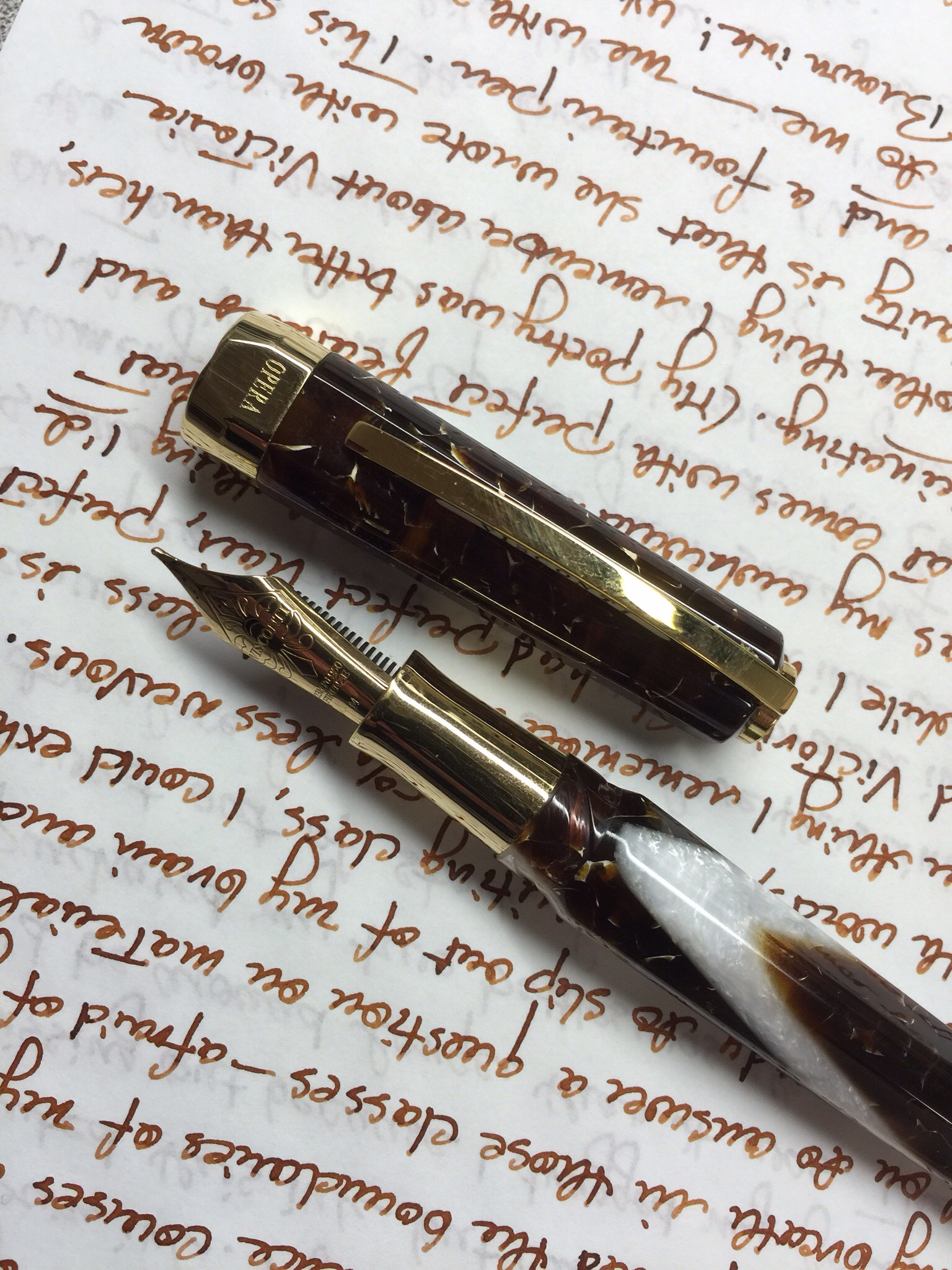
One of the pens I purchased at the 2016 DC Pen Show was a Franklin-Christoph Model 45 XLV made from a Jonathon Brooks material. (Whoa! Who knew this was a thing?!). The pen’s body is a wonderful mix of purple and green and white with a subtle shimmer that suddenly wows you when the light is just right. In that vast, vast sea of pens that is the DC Pen Show, this is one of the two pens that called my name.

Add a little sunlight, and this…

Franklin-Christoph Model 45

becomes this. (Photos really don’t do this pen justice. But trust me, it’s a pocket-sized beauty.)

Franklin-Christoph Model 45

Jim Rouse, of Franklin-Christoph, outfitted it with a 1.1 mm steel nib, and filled the pen with Franklin-Christoph’s Midnight Emerald ink, at my request. After the tiniest of adjustments by Jim, the nib performed wonderfully—smooth, with just the right amount of wetness—and quickly became one of my favorite pens for doing my morning pages. I love the 1.1 mm stub because of the interest it adds to my handwriting, and it’s not a nib that I own many of. (Good choice, Mary!)

Writing sample

Here’s the scene. Last Sunday night, 10:45 pm. Husband and dogs are fast asleep, and have been for some time. I’ve ironed my clothes, made my lunch, and printed the week’s to-do lists. The weekend’s been a good one. I’m rested(ish) and ready to face Monday. But first, I need to lay out my morning pages journal and pick out a pen. That’s my nightly ritual.

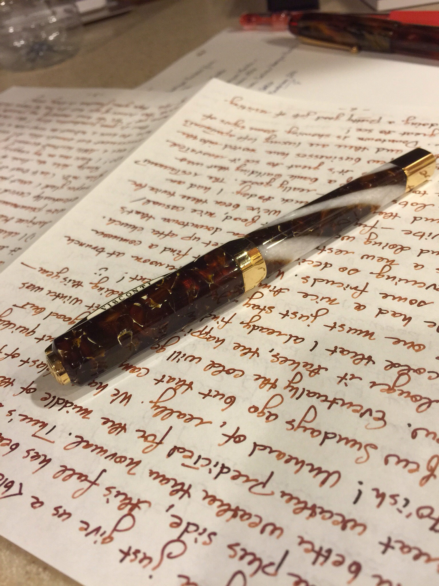
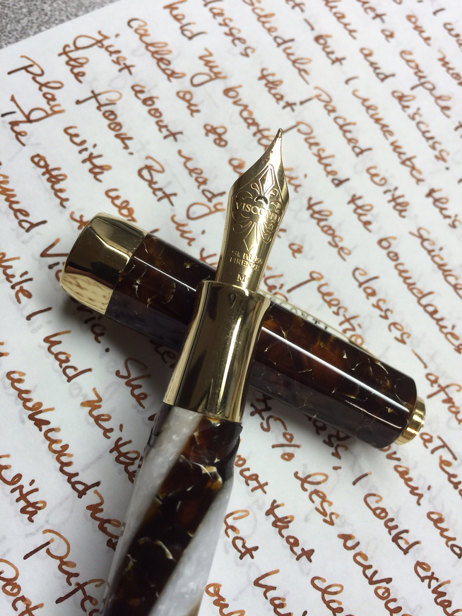
Journal is taken from the desk drawer and I think, hmmmmmmm, which pen? After mentally cycling through all of the ones I have inked (too many), I decide to use the F-C Model 45. Lovely material, excellent nib, pretty ink. Perfect.

I should have gone to bed RIGHT THEN. But I didn’t. Nope.

Instead, I had a thought. A thought that quietly whispered, “There might not be enough ink left in that pen. You’d better check.”

So I checked. By opening the pen. At my desk. Over the carpet.

AS I WAS DOING IT, my brain clicked on, and screamed, “THIS PEN WAS EYEDROPPERED!!!” A hemorrhage of ink flowed from the body of the pen, onto my desk chair and the carpet. Midnight Emerald ink onto a light rose/taupe carpet. My, god!!

I stood frozen and horrified. This was not something you want to do five minutes before going to bed. Or ever, really.

I yelled for Fred—both for the need to confess my awful mistake and to have some help cleaning up the mess. He continued to sleep, blissfully unaware. I briefly considered running away.

(I wish I’d had the presence of mind to take pictures of the ink pooled on my desk chair and splattered from here to kingdom come, but all I could think of was, I’ve got to clean this up. Like, right now! So there’s no photographic evidence, but trust me, it was bad.)

Using paper towels, I made short work of the puddle on my desk chair. The chair is cherry wood so the ink cleaned right off. Phew.

In my rush to sop up the spatters on the carpet, I unknowingly leaned into some of the stains with my knee and wound up adding still more ink to the carpet every time I knelt down to blot at the spillage. GAH!

After I blotted up all that I could, I remembered that I had a small bottle of Amodex in the hall closet. Amodex- an ink and stain remover! Yay!

IMG_2054

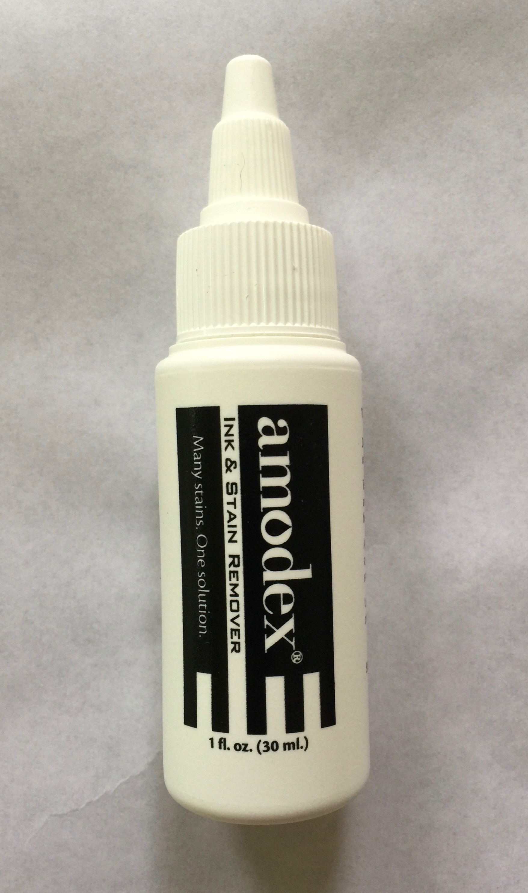
I applied the magic solution, waited, blotted, and scrubbed. The stains lightened. But there were, it turns out, more stains than there was Amodex. I needed an industrial size bottle, not 30 mLs.

By now Fred was up. My yelling had finally penetrated his dreams and he bolted into the living room thinking I’d hurt myself badly enough to require an ambulance. When he saw the real problem, he was relieved that there was just a damaged carpet and not a damaged Mary. “Who cares?” he said, as I pointed to the drips and drabs and splotches.

Truth be told, the carpet has seen better days. Changing it out is on the to-do list. The dogs have not been kind to this decades old carpeting, so some ink spatters are probably the least of its worries. But still I dabbed and scrubbed, now using carpet cleaner and a toothbrush. The spots faded a little more but it quickly became clear that they would always remain to some degree. They would tell visitors that I’m into fountain pens. And that I’m an idiot.

IMG_2037

“Go to bed,” Fred said, and so I did, the adrenalin still coursing though my body.

In the morning I decided that I sort of like them—the Jackson Pollackesque drops and dribbles. It’s only ink. The carpeting’s old. There are bigger problems. (New rule, though: ALL pens are opened over a sink.)

I decided, after a good night’s rest, that I’d share this cautionary tale. This tale of what not to do.

My stain. Your gain.


Yet Another Architect Grind

Levenger Element Guilloche

It’s déjà vu all over again. Yup–it’s another Architect Grind by Dan Smith (@nibsmith). When I sent him my Edison Glenmont (broad) for this grind, I also sent along this Levenger Element Guilloche (medium) for the same treatment. The original nib was perfectly acceptable—smooth and wet—but needed a little more pizzazz.

Levenger Element

Dan’s mad nib skillz took this nib from acceptable to WOW!

Levenger Element

Loaded from my new bottle of Pelikan Edelstein Aquamarine—Edelstein’s 2016 Ink of the Year—this great looking pen, beautiful ink, and jazzed up nib make a great team. The ink behaves well and shades nicely—at least on the narrow range of papers I’ve used it on (Tomoe River, Life Bank Paper, this Levenger Vivacious Circa refill).

Architect Grind

Like the modified nib on my Edison Glenmont, this custom-ground Levenger nib can be easily swapped into my other Levenger True Writers, like the pretty, pretty Kyoto.

Guilloche

(Mmmmm…Guilloche. Sweet stuff.)

So now I have both a medium and a broad Architect grind, and feel sure that I’ll have the same done to a fine nib in the not-too-distant future. Dan does great work, at a fair price, with good turnaround times.

Hobonichi with Architect Grind

Architect again. Happy again.

All of Dan’s nib services can be found HERE. There’s no charge for the added happiness. That’s included with each and every modified and expertly tuned nib.

———————————

Life just keeps happening. My dad had some unexpected surgery yesterday and is currently recovering. At 87, surgery and hospital stays are no joke, but he seems to be doing okay. First my mom, now him. I haven’t been able to write here as much as I want to lately, but I’ll be here when I can. Lots of cool things in the queue!

On a better note, I had an excellent appointment with my MS doctor last week, and he’s very pleased with how I’m doing. The appointment was a great incentive to keep at it in the gym with weights, cardio, and tai chi. Onward!

———————————

All pens, ink, and nib services mentioned here were purchased with my own funds. There are no affiliate links in this post.

Perfect: SBRE Brown Ink

In college, I was bumped from a regular English class to one more focused on writing. A small group of us met a couple times a week to write, read, share, and discuss. I have little memory of what I wrote, but I remember this class as a bright spot in a schedule packed with challenging science and math courses that tested the limits of my 19 year old brain. I held my breath in those classes- petrified of getting called on to answer a question on material that was in grave danger of slipping right out of my head and onto the floor. In this writing class, I could exhale, play with words, and feel 65% less nervous.


The other thing I remember about this class was a girl named Victoria. While I had chipmunk cheeks and looked like I was fresh out of junior high, Victoria had dark eyes and perfect hair. She gave off a Kate Middleton kind of vibe- confident in the way that someone who’s stunningly good looking is confident. Perfect, while the only thing I’d perfected was my awkwardness.

I found her fascinating. My poetry was better than hers, but still.


But it wasn’t just her looks and confidence that fascinated me- it was the fact that she always wrote with brown ink. With a fountain pen and brown ink! I scribbled in notebooks with a lousy ballpoint from Woolworth’s, laying down erratic handwriting that tilted to the right for awhile then suddenly leaned back to the left. My script was as random as my outfits, while Victoria’s was as perfect as hers.

Maybe that class and that girl is why I tend to fall hard for brown ink. I associate it with something that seemed impossibly exotic to little ol’ ordinary me. Victoria and I existed in different orbits, as did our pens and inks. God, I wanted that brown ink. AND that handwriting.


Which brings me to this brown ink- SBRE Brown’s brown ink. I came dangerously close to missing out on this, as I stupidly dragged my feet, casually thinking that it’d be around forever. The day that I finally got around to placing my order was also the day that it went out of stock for good. That was a little too close for comfort.

Because- ohmigod- do I love this ink. Yes, I seem pre-disposed to fall for brown inks, but this one pushes all of my brown ink buttons like no other. It’s caramelly and rich, with great shading and flow- truly delicious in this Visconti Opera Elements Air, with its medium nib, on Tomoe River paper. I’m plowing through it by the converterful, and fretting about my supply like Scrooge worried over his gold coins.

This is the brown ink I’ve been looking for my whole life. Well…since 1978, anyway. My looks are still “eh,” and I still exhibit more than the recommended daily allowance of awkwardness, but who cares. My handwriting eventually came around and I have my brown ink. I have THE PERFECT brown ink.

Though his ink is no longer available, you can always keep tabs on what Stephen is up to at http://www.sbrebrown.com/.

The Verdict: TWSBI ECO with J. Herbin Emerald of Chivor

TWSBI ECO with Emerald of Chivor ink

The pre-release photos of J. Herbin’s Emerald of Chivor ink were so dramatic that I was drooling over the stuff well before it was available for purchase. The reviewers often used folded nibs which brought out the shine and sheen in very dramatic fashion. I don’t own a folded nib so I knew that my results would be more subdued, but I still pounced on the ink as soon as it was available. I picked up two bottles as fast as my “BUY NOW” finger could hit “Enter.”

TWSBI ECO

There was a lot of chatter about the suspended gold particles in the ink, and speculation as to whether or not the particles could/would clog a pen’s feed. So I after I ordered the ink I spent some time thinking about the pen that I’d use it in. I decided to steer away from pens that were pricey or very dear to me, and knew I’d want to go with something replaceable, should there be catastrophic cloggage. One of my many Lamy Safaris would’ve been a perfectly fine candidate, as they aren’t costly, and nibs, or even whole pens, are easily replaceable without breaking the bank.

TWSBI ECO

But instead of going the Lamy route, I caved and purchased a couple of TWSBI ECOs— a white one with a bold nib and a black one with a medium nib. I initially decided to forgo the ECO as I wasn’t sure I liked the look, and was content with my 540s, 580s, Vac 700, Micarta, and Minis. That seemed like plenty o’ TWSBIs for one person. But then I got it in my head that an ECO paired with the Emerald of Chivor ink would be the perfect match, and my “no more TWSBIs” resolution evaporated, as many of my pen-themed resolutions seem to do.

TWSBI ECO

So…was that a good move?

TWSBI ECO filled with Emerald of Chivor ink

Hell Heck, yeah!

TWSBI ECO

The TWSBI ECO is a very reasonably priced ($28.99) piston-filler fountain pen available with EF, F, M, B, or 1.1 Stub mm nibs. I find the 1.1 mm to be a little too wide for my handwriting, but wanted a good amount of ink on the page so I opted for both the bold and medium versions. At the time of this review, I’ve only inked the pen with the bold nib and am very happy with the nib’s smoothness and wetness. My small handwriting is still legible and some of the dramatic characteristics of the Emerald of Chivor ink pop on the page, though maybe not as much as would be seen with a wider stub. It’s a good compromise for me—a good amount of ink, some shine, some sheen, and legible writing.

TWSBI ECO

The clear barrel allows for an unobstructed view of the gold sparkles in the ink. I may be easily fascinated, but I have to admit that this sight continues to dazzle me. A quick shake of the pen and the gold particles are resuspended so that they flow onto the page.

On Rhodia paper

On Rhodia paper, I see a good amount of sparkle, but not much of the red sheen. Still, the color is killer and there’s enough pizazz here to make letter writing or journaling, or even to-do lists, fun.

On Tomoe River paper

On Tomoe River paper is where this ink really shines and sheens. It’s hard to capture with my so-so camera and lighting, but there’s a lot going on on this page—red and gold and teal and blue. It’s pretty marvelous.

Tomoe River paper

I have two bottles and expect that this pen will be continuously inked until I run out. I can’t speak to how hard or easy it is to clean a pen inked with Emerald of Chivor as I haven’t done that yet, and it may be awhile before I do so.

TWSBI ECO

Maybe this Emerald of Chivor seemed too good to be true, or over-hyped, but I’m in love with it. It mesmerizes me in the pen and on the page. Especially as the days turn darker and grayer, the surprising pops of color and shine in the words I write make me swoon in an inky kind of way. And for me, the TWSBI ECO is the perfect vehicle—sturdy, transparent, easy to fill (and probably to clean), with an easy-to-swallow price tag—to lay down a smooth rich line.

I love it when a plan comes together.

Like Nature: Montblanc Daniel Defoe Palm Green Ink

Many thanks to the fine folks at Pen Boutique for providing this bottle of Montblanc Daniel Defoe Palm Green ink for review. There are no affiliate links in this post and I was not, nor will I be, monetarily compensated. This review reflects my experience with, and observations of, the ink.

Montblanc Daniel Defoe ink

We tend to think of the grass as merely green. Same goes for the trees. During my walk yesterday I noticed just how many different shades of green there are in the fields and lawns and trees along my route. Pale fresh greens, darker mature greens, and just about every shade in between. Yellow greens in the grasses. Bluish greens in the pines. Too many greens to name or count. To call the trees and weeds and lawns and fields merely green would be selling nature short.

Green ink comparison

The same goes for Montblanc’s Daniel Defoe Palm Green ink. To call it simply green would be a mistake as this is an ink full of shading and surprises. To be honest, I’ve been fiddling with this review for a bit, and I finally figured out why. Reviewing ink is a tricky thing as accurately portraying an ink’s color is affected by so many variables— outdoor light and indoor lighting, nib size, particular pen characteristics with regard to flow, paper choice, camera settings and performance, computer display parameters, etc. I worried about “getting it right.” I think it’s been particularly tricky with this ink because it keeps looking different to me, which, of course, is something to celebrate, not fret about.

Writing samples

I wrote my first draft with my Visconti Opera Elements (medium nib), and really loved the way the natural looking green shades from a grassy light green to a deeper earthy olive shade. The ink is easy on the eyes— soothing but not boring. This is an organic green— very natural, very fresh.

Visconti Opera Elements on Tomoe River paper
On Tomoe River Paper using a Visconti Opera Elements with a medium nib

Wanting to test out the ink in a different pen with a different nib, I loaded up a Lamy AL-Star with a 1.1 mm stub and wrote another draft on a Rhodia dotPad.

writing sample with Lamy AL-Star 1.1 mm stub nib
On Rhodia dotPad using a Lamy AL-Star with 1.1 mm stub nib

Though it’s a perfectly nice looking green in a fine nibbed pen, the plucked-from-nature shading truly reveals itself in pens with broader nibs.

Dry time test
Dry time testing on Rhodia dotPad

The ink seems to have a little bit of a longer dry time than other inks I’ve used recently, so I ran a quick test, and my results seemed to bear out that impression. Again, dry time can be affected by so many things— paper, ink flow, humidity, etc.— so don’t take my results as gospel.

Ink swatch and writing sample

Montblanc’s Daniel Defoe Palm Green is aptly named as it calls to mind a tropical island with lush verdant foliage. The shading in this ink is equally lush and celebrates the range of greens seen on mountain trails, in seagrasses, on tropical palms, and in meadows. It’s complex and full of surprises— just like nature.

Montblanc Daniel Defoe Palm Green Ink


Pen Boutique is selling the Montblanc Daniel Defoe Palm Green ink for $19. Not a bad price for a mini-tropical vacation!

For another take on the same ink, check out Ana’s review HERE.