Prior to spending time with this new Blueberry Esterbrook Estie SE, here’s what popped into my head when I heard the name Esterbrook:
- Those iconic vintage J-series fountain pens that accept a multitude of Esterbrook nibs;
- That 2014 “rebirth” of the Esterbrook brand by Robert Rosenberg that did not seem to go particularly well.
I have a couple of vintage Esterbrooks but they haven’t, as yet, found a true place in my heart. I suspect that I need to explore the various vintage nib offerings and find one that really speaks to me. I look forward to that eventual deep dive. I won’t rehash the issue with that first re-launch of the brand, but it left something of a bad taste in my mouth for the “new” Esterbrook.
But that was then, and this is now. In 2018, Joel Blumberg, Kenro’s founder and president, acquired the rights and patents for the brand and relaunched Esterbrook the right way, by honoring the vintage spirit of the brand with fresh designs and quality workmanship. THIS re-birth, I’m happy to say, is cause for celebration.

I’ve been using this Blueberry Estie SE with silver trim (it’s also available with gold trim) the last couple of weeks for writing my morning pages, and I’m enjoying it very much. It’s the pen I reach for despite having several others inked and at the ready. The look, the feel, the writing performance are all on point. SE stands for “Special Edition,” as this pen is limited to 500 pieces, equally split between the gold and silver trim models, but are not numbered.
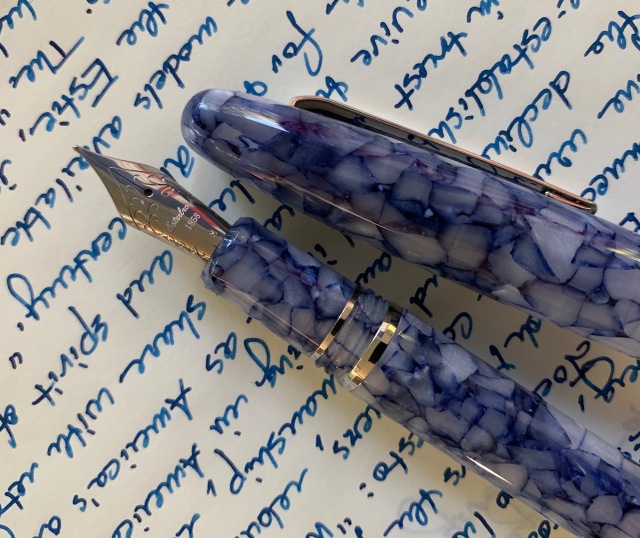
The blue “cracked ice” acrylic is highly polished so the pen is extremely smooth to the touch. Finishing is superb. I have absolutely no complaints with fit or finish. This particular acrylic looks a little more gray in indirect light, while the blue pops in brighter light. There’s shimmer and depth and a lot of visual interest in this material.

My pen is outfitted with a medium #6 JoWo steel nib that lays down a true medium line. I’ve experienced no hard starts or skips. It was a great performer right out of the box, which is never a given. The nib starts up easier than I do every morning at 4:45 am. It’s reliable and smooth. Very pleasant.

Some shimmer and sparkles
A “cushion cap closure” inside the pen’s cap prevents the nib from drying out, which is why the pen always hits the page running. I filled the included converter with Montblanc’s Leo Tolstoy, one of my favorite inks and a great match for this acrylic.
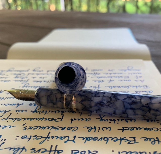
A peek at the Cushion Cap Closure tucked inside the cap
Capped, the pen measures 5.9″. Unposted, it’s a very comfortable 5″, while posted, it’s a very long 6.7″ (feels like a saber). Overall weight is 24 grams. I find it to be very comfortable, neither too light nor too heavy.

Now here’s where things get really cool. The Estie can be outfitted with an MV Nib Adapter (available separately) which is designed to hold many of those vintage Esterbrook nibs. As I said earlier, that’ll be a fun rabbit hole to explore.

Branding is minimal, and the highly polished clip does its job, without interrupting the clean look of the pen. (The flag you see on the clip in the above photo is just a reflection of one on my patio. This thing is like a mirror.)

Though I came to the Esterbrook Estie with some skepticism, I find myself impressed with this offering, and look forward to future releases of different models and materials. As a lover of fall colors, the new Honeycomb Estie is right up my alley. What a beautiful autumnal acrylic.
Esterbrook’s manifesto states: We want to reconnect with consumers, rebuild interest in fine writing and penmanship, revolt against the decline of handwriting in American schools, reestablish brand image as America’s Original, regain trust and market share with retailers, and revive the values and spirit of Richard Esterbrook for the 21st century.
If this Blueberry Estie SE is any indication, Esterbrook is a brand to get excited about once again.
Thanks to Pen Chalet for providing this pen for review purposes. This review represents my own impressions and experiences with the pen. There are no affiliate links in this review.


