The Ink Debacle: A Cautionary Tale

Prior to the DC Pen Show, I took the Vanness Pen Shop up on an offer to order a couple of bottles of Akkerman ink, for pick-up at the show. By pre-selecting, and pre-paying, I wouldn’t have to worry about them running out of the colors I was interested in.  This was especially appealing because I was only able to attend the show on Sunday and I figured they’d be picked clean by then. So I ordered Akkerman #18 (Garuda Rood) and #24 (Zuiderpark Blauw-Groen).

On Sunday morning, the Vanness Pen Shop booth was my first stop, and since the ink was already paid for, it felt like I was getting it for free! The colors I reserved WERE sold out, so my approach was a sound one. I couldn’t wait to take a look at those cool Akkerman bottles.

Akkerman Ink packaging

If you’re not familiar with them, Akkerman ink bottles (60 mL, from the Netherlands),  feature a wide bottom with the long neck. This neck contains a marble that seals off the opening after the neck is filled with ink. So, to fill your pen, you tip the bottle, the marble slides out of the way and the neck fills with ink. Tipping the bottle back to an upright position causes the marble to drop into place to seal off the neck. Dip your pen into the “trapped” ink to fill it, then partially tip the bottle so that the marble dislodges and the ink flows back into the bottle. It’s a unique and very well thought out system. I’ve wanted Akkerman ink FOREVER. Well, at least since 2012, which feels like forever.

And I FINALLY had some.

We shopped all morning, took a break for lunch, then shopped and browsed a little more. I wound up with a bunch of bags…the goodie bags handed out upon entry to the show, as well as the bags I accumulated during the show. I was very careful to keep track of my stuff— double and triple checking myself after each stop at a table. I’d freak if I left something behind. But there’s confusion and excitement, sort of a recipe for disaster.

At the end of the day, we flopped in our hotel room and I took inventory. All present and accounted for. Exhale.

We stayed around a couple more days, headed into Baltimore on Monday to explore the city and visit with Chris and Mark of Write Notepads & Co. (more on that in another post). That evening, we took in a Yankees/Orioles game at Camden Yards. Each time we ventured out of the hotel, I stashed my pens– the ones I’d purchased as well as the ones I’d brought from home— in the in-room safe, just in case. I left all of the other stuff— some Write Notepad Co. notebooks, Montblanc Oyster Grey ink, some free Delta ink samples, and the Akkerman ink in the handle bags in the room.

Finally, it was Tuesday morning— time for the 7+ hour trip home— and we had to skedaddle. We had to make it home by 6 pm in order to pick up our four dogs from the vet/boarding so speed was of the essence. We packed up after breakfast, I double-checked the closet and the safe, scanned the room, and hauled everything to the car in one trip. The trip home was miserably rainy, but I love road trips, so it was a fun day. We picked up the boys at 5:30. Perfect.

After unpacking and laundry (ugh!), I rooted through my stuff, pulled out the Wahl-Eversharp Technik fountain pen and inked it up. Wow- what a wonderful nib! I screwed around with that for the evening, then JUST before bed, I thought, “Hey, let’s take a look at that Akkerman ink!”

You probably see where this is going.

I went through the first handle bag looking for the little brown bag holding my Akkerman boxes. Hmmm. Well, it’s gotta be in this other bag. Nope. Or in THIS bag. Nope.

Cue instant nausea.

NO AKKERMAN INK ANYWHERE.

Despair. Disbelief. Confusion. Anger. Blame. I passed through all of the possible stages of missing-ink grief in a matter of minutes. I sprouted an instant headache.

I called the hotel, gave them my name and room number and information about the ink (feeling a little bit like a weirdo). I mean, people leave pillows and laptops and stuffed animals, but INK? They took my information but in my mind, I’d already written it off. It’s gone, I kept saying, to myself AND out loud.

This is not the type of thing to discover right before bed.

The next day I had a call from Virginia. Florida,  a manager at the Sheraton Tysons Hotel, called to follow-up and asked for a more complete description of the ink and the bag I had it in. I googled some Akkerman images and sent them to her. I explained that it HAD TO BE in room 1617 in a small brown paper bag with my name on it. She said she’d contact Housekeeping to see if they’d found my ink.

Later on, another call from Virginia. My heart jumped! But no, this call was from Elizabeth, the Housekeeping manager, saying that she’d do her best to track it down. People might already be in the room, though, she said, but she’d see what she could do.

Then in the afternoon, the call I was sure wouldn’t come came. They’d FOUND MY INK in the room. Florida confirmed my credit card # and said she’d have it shipped out asap. My headache, and nausea, receded.

What a great feeling. What great customer service! I raced to my desk and wrote both Florida and Elizabeth thank-you notes. I tweeted thank yous! I gave them all 5’s on the Sheraton survey that arrived via email. I was, you could say, very happy. And relieved. AND puzzled.

Where the heck was the ink in the room??? How had we missed it when we scanned the room on our way out??? Well, we’ll never know the answer, but who cares? The ink arrived in excellent condition, and I cherish it even more than I would have had it made the trip home with us.

Lamy AL-Star Blue-Green

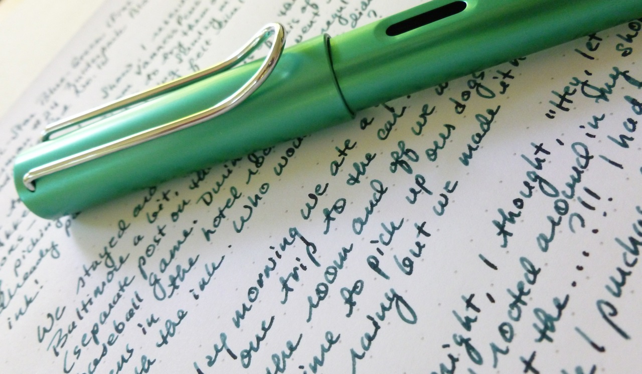
I’ve been using the Akkerman #24, a gorgeous blue-green (Blauw-Groen) in my Lamy AL-Star Blue-Green (fine nib) and they complement each other perfectly. This particular Lamy writes exceptionally well, very smooth. That ink in this pen is a great match.

Lamy AL-Star Blue-Green on Akkerman #24

My Akkerman ink took the long way home, but it’s here now, and I love it. I’ll be forever grateful to Florida and Elizabeth at the Sheraton Tysons Hotel for taking a genuine interest in my stupid little debacle and for providing stellar customer service. Even if they hadn’t been able to track down my ink, I would’ve been grateful for their efforts and phone calls.

So we have a happy ending and some lessons learned the hard way:

  • Make a list of your purchases (or really, all of your critical items) and take inventory before you leave the hotel.
  • Consolidate everything into as few bags as possible.
  • Never leave the hotel room in just one trip. Always go back for a second or third look.
  • Don’t let your spouse or partner rush you!

Don’t say I didn’t warn you.

Akkerman packaging

Akkerman #18 and #24

Akkerman #18 and #24 with Lamy Al0Star Blue-Green

Such cool bottles filled with excellent ink. Smile.


Like Nature: Montblanc Daniel Defoe Palm Green Ink

Many thanks to the fine folks at Pen Boutique for providing this bottle of Montblanc Daniel Defoe Palm Green ink for review. There are no affiliate links in this post and I was not, nor will I be, monetarily compensated. This review reflects my experience with, and observations of, the ink.

Montblanc Daniel Defoe ink

We tend to think of the grass as merely green. Same goes for the trees. During my walk yesterday I noticed just how many different shades of green there are in the fields and lawns and trees along my route. Pale fresh greens, darker mature greens, and just about every shade in between. Yellow greens in the grasses. Bluish greens in the pines. Too many greens to name or count. To call the trees and weeds and lawns and fields merely green would be selling nature short.

Green ink comparison

The same goes for Montblanc’s Daniel Defoe Palm Green ink. To call it simply green would be a mistake as this is an ink full of shading and surprises. To be honest, I’ve been fiddling with this review for a bit, and I finally figured out why. Reviewing ink is a tricky thing as accurately portraying an ink’s color is affected by so many variables— outdoor light and indoor lighting, nib size, particular pen characteristics with regard to flow, paper choice, camera settings and performance, computer display parameters, etc. I worried about “getting it right.” I think it’s been particularly tricky with this ink because it keeps looking different to me, which, of course, is something to celebrate, not fret about.

Writing samples

I wrote my first draft with my Visconti Opera Elements (medium nib), and really loved the way the natural looking green shades from a grassy light green to a deeper earthy olive shade. The ink is easy on the eyes— soothing but not boring. This is an organic green— very natural, very fresh.

Visconti Opera Elements on Tomoe River paper
On Tomoe River Paper using a Visconti Opera Elements with a medium nib

Wanting to test out the ink in a different pen with a different nib, I loaded up a Lamy AL-Star with a 1.1 mm stub and wrote another draft on a Rhodia dotPad.

writing sample with Lamy AL-Star 1.1 mm stub nib
On Rhodia dotPad using a Lamy AL-Star with 1.1 mm stub nib

Though it’s a perfectly nice looking green in a fine nibbed pen, the plucked-from-nature shading truly reveals itself in pens with broader nibs.

Dry time test
Dry time testing on Rhodia dotPad

The ink seems to have a little bit of a longer dry time than other inks I’ve used recently, so I ran a quick test, and my results seemed to bear out that impression. Again, dry time can be affected by so many things— paper, ink flow, humidity, etc.— so don’t take my results as gospel.

Ink swatch and writing sample

Montblanc’s Daniel Defoe Palm Green is aptly named as it calls to mind a tropical island with lush verdant foliage. The shading in this ink is equally lush and celebrates the range of greens seen on mountain trails, in seagrasses, on tropical palms, and in meadows. It’s complex and full of surprises— just like nature.

Montblanc Daniel Defoe Palm Green Ink


Pen Boutique is selling the Montblanc Daniel Defoe Palm Green ink for $19. Not a bad price for a mini-tropical vacation!

For another take on the same ink, check out Ana’s review HERE.

My Pencil: The Palomino Blackwing Pearl

Many thanks to JetPens for sponsoring the purchase of the pencils reviewed here. There are no affiliate links and I was not monetarily compensated. This review reflects my opinions and experiences with the pencils. 

Palomino Blackwing Pearls

I blame— or credit— the Erasable podcast for the avalanche of woodcase pencils that have taken over my house. I was bit of a pencil hoarder before, but thanks to their enabling, I’ve taken a deep-dive and purchased and collected more pencils than an entire elementary school could use in a few years. (Some donations may be in order.) I’ve proclaimed the Palomino Blackwings and Palomino Blackwing 602s as some of my favorites, and even got my mother hooked on them. (Great Mother’s Day present, by the way!)

Palomino Blackwing Pearls

Turns out the Blackwings and 602s were merely gateway drugs to a new pencil high experienced with the purchase of the Palomino Blackwing Pearls. When you find yourself walking around your pencil-stuffed house mumbling, “Where IS my Palomino Pearl?”, you know you’ve found your drug…ummm…pencil.

Palomino Blackwing Pearls

I’ve always been a sucker for a true “pearl” finish— on cars, pens, etc.— and these pencils shine with their pearly white coat. I can’t really capture it in my photos, but it’s a lovely and unusual look for a pencil. I think it’s stunning. So yes, I initially judged this pencil by its finish.

Palomono Blackwing Pearl on a writing sample

Pearl writing sample

But to love this pencil for its finish alone would be short-sighted. The Pearl lays down a creamy feeling line— smooth and dark with a point that lasts and lasts. It’s crazy good. Of the 602, Blackwing, and Pearl, I like this one the best. To my eye, the line seems to fall between the 602 and Blackwing in terms of darkness, and with better point retention than the Blackwing. But what do I know? I’m new to this whole pencil game, so take these details with a grain of salt. Bottom line, though, this is a VERY NICE pencil.

Pearl's replaceable eraser

Pearl's replaceable eraser

If you’re new to the Blackwing line, you may not realize that the uniquely shaped eraser is adjustable AND replaceable. That is, you can “scooch” up the eraser in the eraser holder as it wears down, then replace it altogether when it gets too small. I tend to use up my pencil before the eraser gives out (I’m a bit of an obsessive sharpener), but it’s a cool feature.

Palomino Blackwing Pearls

I’m only exaggerating slightly when I say that opening this box of pencils was one of those “I hear the angels sing” writing instrument moments. (I’m not the only one who has those, am I?!)

Palomino Blackwing Pearls

The Palomino Blackwing Pearls— I have found my pencils.

Palomino Blackwing Pearls

———

Want to hear the angels sing, too? Check out JetPens Palomino Blackwing offerings HERE. Hey, there are some pretty cool colored replacement erasers. I didn’t know that until just now!

On Fire: The Delta Unica Red LE Fountain Pen (via Anderson Pens)

Delta Unica Red LE Fountain Pen

I rarely come away from watching the Anderson Pens video podcast without jotting yet another pen onto my wish list. Case in point— just before the DC Supershow, Brian and Lisa announced their Delta Unica Limited Edition Fountain Pen, in a gorgeous red acrylic that’s an Anderson Pens exclusive. Wowza.

Oh, that acrylic!!
[Oh, that acrylic!]

With just fifty pens in this color, I was intrigued. And when I heard the price— just $85 (a small premium over the regular Delta Unica colors)— I knew I wanted this pen. BUT, I was getting to the pen show for Sunday only, so I spent a lot of my road trip from New York to Virginia worrying that they’d be gone by the time I was able to shop. PEN ANXIETY!

They were gone. I didn’t get one. The End.

KIDDING.

I hit the Anderson Pens table(s) pretty quickly on Sunday morning and was relieved to find that there were still some left. I chose #34/50 (medium nib), got one of Lisa’s famous hugs, talked to Brian, and ran off to pinball my way around the rest of the show. (Why I can’t seem to do a pen show in an orderly fashion is beyond me. I think it’s adrenaline.)

AP 34/50 Limited Edition
[Limited Edition, Anderson Pens, 34/50]

Once home, the first pen I inked and spent time with was my Wahl-Eversharp Skyline Technik fountain pen (LOVE that thing), so I didn’t get around to inking the Delta until a couple of weeks ago. And that’s when I found a bit of a glitch. The pen would write, then stop, then write again. Sometimes it flooded the paper with ink, while other times it ran completely dry. Well, shoot.

Once I took a close look at the nib, the problem was obvious— the nib tines were simply too far apart. I contacted the Andersons by email, included a couple of photos to illustrate the problem, and had a speedy reply from Brian. At his recommendation, I mailed the pen to him, he fixed the nib, and returned it to me asap. Great service after the sale.

Delta Unica matte steel nib
[All better.]

NOW it writes as good as it looks.

Delta Unica LE Red Fountain Pen

It truly is a stunning pen. The red marble acrylic has amazing depth and sheen and looks like it’s on fire from within. Branding is VERY subdued. (You can just make out the “DELTA/ITALY” engraving at the bottom edge of the cap in the picture above.) The clip features a little roller that makes sliding the pen in and out of a pocket or case snag-free. I love the shape of the cap— how it subtly flares out— giving the pen a really clean and simple, but interesting, profile.

Delta Unica vs. Lamy AL-Star
[Size comparison: Delta Unica vs. Lamy AL-Star]

The size is perfect for me (4-3/4″ unposted, 6″ posted). The cap posts securely and doesn’t throw off the balance of the pen. The 0.46″ grip feels great in hand, and the threads and oh-so slight step-down do not interfere with my grip at all. It’s a joy to hold and use. The pen weighs 22g (15g body, 7g cap)— light enough for even an extended writing session.

Delta Unica Matte Steel nib

The nib is steel in a matte finish, and features branding that I find to be a little busy. The writing experience is a smooth and juicy one, with just a bit of feedback. The Unica is cartridge/converter pen, and a converter is included. I’ve filled mine with Sailor Jentle Grenade, a color that was MADE FOR this acrylic.

Delta Unica in LE Red Acrylic
[On fire!]

I’m very pleased with my Delta Unica LE fountain pen— my Anderson Pens Delta Unica. It’s hot looking, writes great, and feels terrific. Brian’s speedy response and quick nib fix proved why it’s important to deal with people you trust. Sometimes things aren’t exactly perfect— with pens as with life— and it’s great to know that there’s someone there should you need help.

Delta Unica LE Red Acrylic fountain pen

Or a hug. (Right, Lisa?!)

————–

Click HERE to watch Brian’s video overview of this pen.

A Collection: ACME Crayon Rollerballs

My pen collection can certainly be called “random.” I sometimes joke that its theme is “no theme.” I’m simply drawn to shiny things— rich acrylics with mesmerizing depth (chatoyancy! a word I just learned), stealthy black pens, transparent demonstrators, and cool colors. I have a little bit of a lot of pens. Pen A.D.D., I guess. EXCEPT in the case of the ACME Crayon rollerballs by ACME Studio.

P1040869

I started out with one pen, either the red or the blue one. That seemed fine for awhile. But then I found that a local Scandinavian Designs store carried them and one led to two which led to three which led to owning the whole collection. Oops.

ACME Crayon rollerballs

I’m such a faithful customer, and ACME Crayon “completionist,” that the shop owner sends me an email when new colors are announced— like the latest purple and teal offerings. What’s also cool is that the shop has (or had) the retired colors— black, white, and silver. Shop local as you never know what lucky surprises you may find!

ACME Crayon rollerballs

The refill is the same as the one for the Retro 51 rollerballs so I usually swap in a Schmidt (or ACME) P8126 as that tip size is the sweet spot for me.  The pens are lacquered brass so they feel substantial and look remarkably like the crayons we had fun with as kids. The colors are so addictive, and not overwhelming in number (just eleven at this time), so owning the entire collection was certainly doable and desirable.

ACME Crayon rollerballs

One thing I don’t quite get is why the green pen has a yellow tip and end cap. Why isn’t it ALL green, like the color of the body? Weird choice by ACME, in my opinion.

In the top photo, you’ll notice my “mutt” pen on the far right side of the photo— a white pen with an orange tip. Sadly, I dropped my white pen on a counter at work and sheared off the brass tip. ARRRRGGGHHH! White is, of course, a discontinued color. I immediately contacted my local dealer…ummm, shop…and found that she still had a few in stock so I quickly purchased a new one. I also contacted ACME to try to get a replacement tip for the damaged pen. Turns out that wasn’t possible, but they did eventually swap in a tip from an orange pen, so it’s usable, but a bit of a hybrid. Lesson learned: Be extremely careful with discontinued pens. DO NOT DROP THEM ON HARD SURFACES. Pro tip.

So while my pen collection is all over the place, my ACME Crayon rollerball collection is currently COMPLETE. I’ve got a Crayon for each and every mood. For some reason, this feels like an accomplishment. For this pen collector, with the attention span of a gnat, I guess it is.

ACME Crayon rollerballs

The ACME Crayon rollerballs remind me of long ago, uncomplicated kid days when I could spend hours lying on the living room rug coloring in a new coloring book. How could I possibly resist buying more of those carefree and happy memories?

Does your pen collection have a theme? I’d love to hear about it.

A Happy Discovery: Fisher Space Pen Cross-style Refills

Cross-style ballpoint pens

I have a few nice pens that have pretty much been dead to me because they take Cross-style ballpoint refills. I’m not a big fan of the regular Cross ballpoint refills as I find them to be too light and too draggy. SO the pens have been gathering dust, which is no life for a pen.

Cross-style ballpoint pens

I happened to be rooting around in my big box ‘o refills when I noticed a couple of Fisher Space Pen Cross-style refills (black ink, medium point). I can’t say that I have any memory of buying them, but unless there are refill fairies, I must’ve.

Cross-style ballpoint pens

I popped them into my languishing pens and – WOW – what a difference! The new refills are dark, smooth, and speedy (i.e., no drag). PLUS- I can write upside down and in extreme temperatures should my day take a turn for the dramatic.

Cross-style ballpoint pens

Fisher Space Pen Cross-style refills- a happy little discovery. So now you know.

Handwritten review