I’ve been a fan of the Pilot Metropolitan since its introduction, and have a handful of the medium nibbled versions in Black/Plain, Gold/Dot, Silver/Zig-Zag, White Tiger, and Purple Leopard. (Might’ve gone a LITTLE bit overboard there, but they ARE kind of addictive in a I-must-have-one-of-each kind of way.)

As you’ve undoubtedly read in numerous other reviews, the Pilot Metropolitan really is a phenomenal value. For just $14.50-$15, you get a very solid, superbly performing pen, along with a squeeze converter and one cartridge. It’s the real deal at an amazingly low price. The metal body has a very nice heft (26g overall; 17g body, 9g cap) that is equally pleasant to write with posted or unposted. The snap-cap issues a satisfying “CLICK” when you cap the pen and posts without a hint of wishy-washiness. Rock solid, is what the Metropolitan is. Obviously, I’m a bit of a Metro groupie.

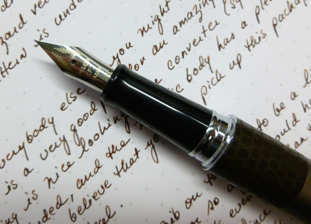
The complete package
SOOOO, when Pilot recently introduced the Metropolitan with a FINE nib, I added the Taupe/Lizard model to a JetPens refill order to boost myself up to the $25 free shipping threshold. The pen arrived last week and I’ve been spending time with it ever since. I decided to forgo the cartridge, and instead filled the converter with Pilot’s Iroshizuku tsukushi (horsetail), which is a good match for the lizard pattern accent band. The lizardish body band is a deep brown that blends well with the taupe body. Others, you may have read, are not exactly head-over heels in love with the animal pattern models, but I think most of them are kind of cool and not too gimmicky looking.

There’s a faction of Metropolitan fans that’s been crying out for a fine-nibbed version of the Metropolitan but I wasn’t one of them. The original models, available only with Pilot’s medium nib— which is equivalent to a western fine— suited me well. But I was curious. Thus the order.
Like every Pilot fountain pen, my Lizard Metropolitan started RIGHT up, without a skip or stutter or hesitation. Pilot pens do not disappoint. The line it put down is supremely sharp and crisp, and felt even finer than the nib on my Kaküno (also fine and also from Pilot). In fact, it felt a little TOO fine, a little too sharp. Not scratchy, but sharp. VERY sharp. Hmmmm.
I’ve been a fine/extra-fine person forever, and only recently branched out into broader nibs, but something in me has changed. I’ve gotten used to the buttery smoothness of those broader nibs and the way that the wetter/thicker line of a medium or broad nib brings out the shading properties of many inks. Writing with such a needle-like nib felt weird. Not bad, just weird.
I kept thinking, “It’s not you, it’s me.” “You’re a really great pen, I’m just not into you.” I did not say these things out loud because that would be weird. But I thought them. (Still weird, isn’t it?!)
BUT…that’s not the end of the story. For the past few days I’ve been using this particular pen when writing in my Field Notes (California State Fair and Night Sky editions) and my opinion took a 180-degree turn. The super-fine nib suits the Field Notes paper perfectly. Whereas a medium or broad nib would be an inky mess on Field Notes paper, with this Metro, there’s little to no feathering and just a TOUCH of bleed-through. And you know what? When I went back to writing on my Rhodia pad, I liked the way it felt on that paper, too. Very precise. Very crisp.

In Field Notes, w/ Iroshizuku tsukushi
Initially, I thought the Metropolitan’s fine nib was TOO fine, but a little time and the right paper changed my mind. It’s probably not a pen I’ll use for letter writing, but for writing out my daily work and home lists, journaling, and jotting down appointments in my homemade Field Notes calendar, it’s just the ticket. It’s also another “candidate” pen for my conference later in the summer (low cost, yet still a great writer).

The Pilot Metropolitan— fine pen, fine nib, fine price.
And I am, it turns out, fine with all of that.


