A Pen With Personality: The Waterman Phileas Fountain Pen

Waterman Phileas x2

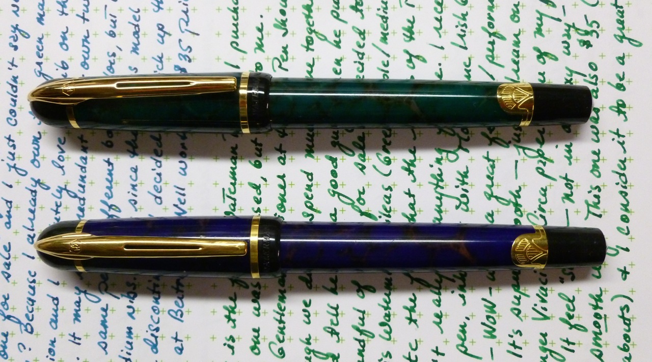
If you were trying to set up the Waterman Phileas on a blind date, you’d probably say that it has a “great personality”— which is code for “not that great looking.” With its “marbled” plastic body, gold furniture, and art deco trim, this isn’t a pen that catches your eye. Some may even consider it a little bit ugly.

Art Deco trim

I met The Gentleman Stationer at the DC Pen Show, and though we didn’t chat for long, I could tell he was a good guy. So when he put a handful of his “surplus” pens up for sale, I took a look, liked the price of the Waterman Phileas he’d listed, and decided to go for it. Up to this point, I didn’t own any Watermans so that was some of the draw— the chance to try a new-to-me brand at a good price.

Green Marble Waterman Phileas

And like I said, when the pen arrived, its looks struck me as unremarkable, and sort of not my style. No chatoyancy, no gorgeous swirls, no rich colors. Oh, well, I thought, it’s only $35. Since the body on this one is green simulated marble, I inked it with Montblanc Irish Green and sat down with it and a piece of Tomoe River paper. Despite the “meh” looks, the minute that nib hit paper, I was a smitten. As I doodled and scribbled, I fell deeper in love with this Phileas, so much so that it actually started looking kind of cute. That funny looking pen shot an arrow right through my ink-loving heart.

Waterman Phileas two-tone nibs

I’ve had this green Phileas continuously inked since it arrived in November 2014. It’s become a go-to pen for letter writing and journaling, or just doodling to take the edge off of a stressful day. So, yeah, smitten. Who woulda thought?!

Blue Waterman Phileas

A few weeks ago I noticed a sale going on at Bertram’s Inkwell, so I took a look (despite my vow to rein in pen purchases this year). And well, whatta ya know, a blue marble Waterman Phileas was listed—again for just $35. I’d made that pen-buying pledge so I mulled this over for awhile before ultimately deciding to buy. (Bert offers a 30-day/100% purchase satisfaction guarantee, so that pretty much clinched the deal.) Even though I already own the green version, the fact that the Phileas is a discontinued Waterman model made this find all that much more appealing.

Writing samples

When the pen arrived, I noted that what is called “blue marble” is actually quite purple. I think Wahl-Eversharp’s Everberry ink—a nice purply blue—would be a great match, but for its first fill I went with Sailor Yama Dori. That ink’s not really a match, but it’s a color I love and use often for letter-writing (especially during this InCoWriMo month). I wondered if the first nib was a fluke, but no—this one is just as nice, though maybe a touch finer. That’s kind of nice—the fact that they don’t write exactly the same even though they’re both medium nibs. Both are phenomenally smooth—kind of “soft” feeling. I don’t mean that in the sense of flex (NOT like the softness on my Visconti Opera Elements nib), but in the way it glides over paper. Whispery. So nice and yet so hard to describe.

Waterman Phileas x2

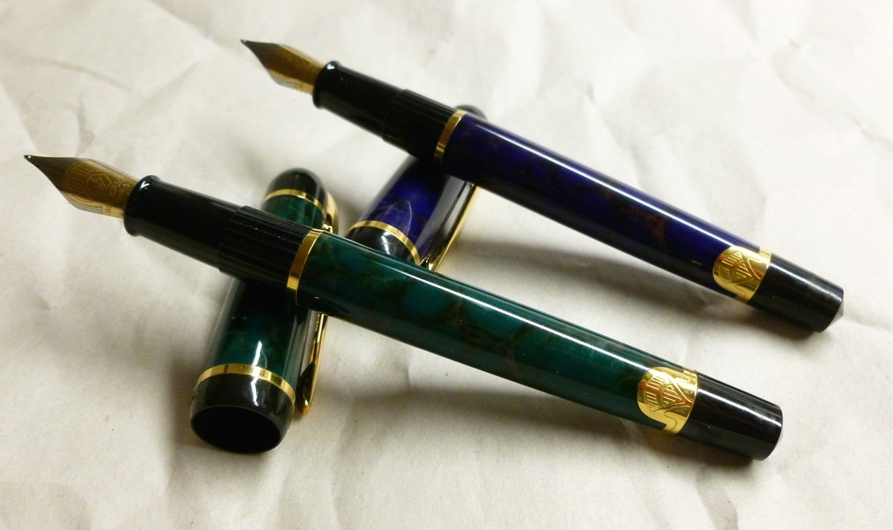
Some quick research reveals that the Waterman Phileas model is from the late 1990’s and is no longer produced. That’s too bad because this pen would be absolutely perfect for a fountain pen novice—a really lovely nib at a great price. (Prices are kind of all over the place on these, no doubt due to the fact that it’s been discontinued.) If I make it to the DC Pen Show in August, I plan to keep my eyes open for some of the other colors—red marble, grey marble, and black—or other nib sizes. I’ve read that the broad nib is particularly glorious.

Uncapped Waterman Phileas

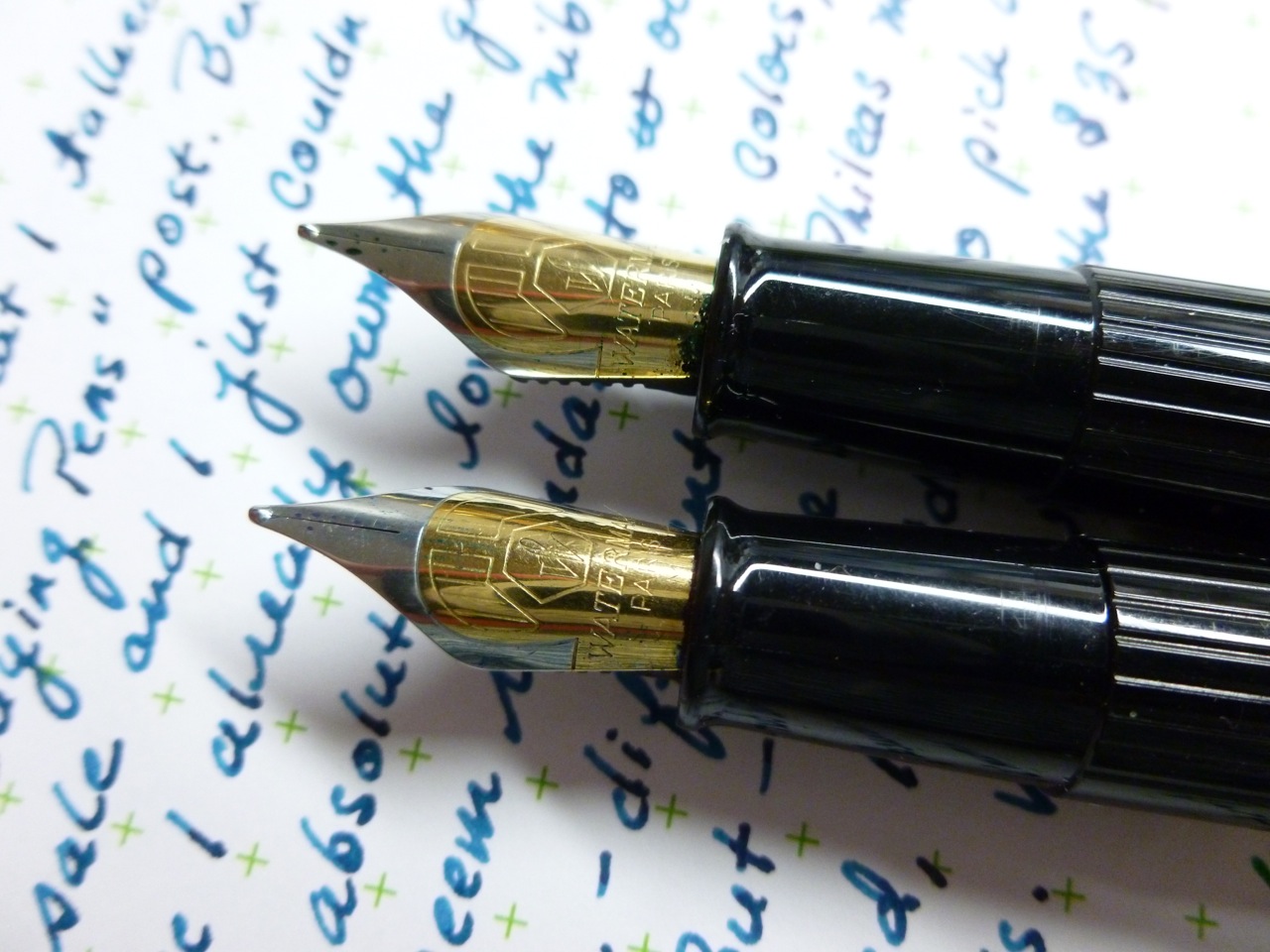
The cap snaps on and off and posts well. The filling system is cartridge/converter, which is fine by me—easy to clean and maintain. I do like the looks of the two-tone steel nib that sports just a hint of that art deco vibe. The pen is light (24g; 17g body, 7g cap), but not overly so—sort of “just right” in hand. It almost feels like it disappears, but again, I think that’s because the nib puts you in a little trance. Well, it puts ME in a little trance.

We all know that saying, “Not everything that glitters is gold.” The Waterman Phileas has taught me that the opposite is also true—not everything that’s gold (or super smooth steel) glitters.

Waterman Phileas x2

Just like that blind date with the great personality, you’ll soon find that there’s something very interesting going on under the unassuming surface of this pen. The Waterman Phileas—the more you get to know it, the better it looks.

Cool: Retro 1951’s Black Fade to Silver Tornado

On National Handwriting Day (January 23rd), I stumbled upon a Retro 1951 contest where a couple of prizes would be awarded for good handwriting while a few more would be randomly chosen. The prize? One of four one-of-a-kind Retro 51 Tornados, or the Goncalo (wooden) Tornado, AND a Retro 1951 t-shirt.

So of course, I entered. Using the Albert Tornado I had with me that day, I wrote out the required tag line:

“Life is too short to carry an Ugly Pen.”

Retro 51 Contest Entry

Winners were announced on January 26th and I…

WON!

My entry was picked for one of the handwriting prizes, and I was thrilled. (I’m still thrilled.)

After looking over the selection of Tornado prizes, I quickly chose the Black Fade to Silver with line cut barrel. The glow-in-the-dark owl/floral pen was a close second, but the Fade pen is more “me.”

Black Fade to Silver Tornado

This one-of-a-kind pen was produced by the factory, but never introduced into the Tornado line. Which seems a shame because it’s super cool. Featuring pitch black knurling and clip, the color of the barrel gradually fades into shiny silver. Toss in the line cut barrel, and you’ve got yourself one stunning, great feeling pen.

Pitch black knurling

It’s stealthy AND shiny— a very unique combination for a very original look.

Black Fade to Silver

The Black Fade to Silver Tornado is a pen that I think would do exceptionally well in the Tornado line-up (and the comments on my Instagram feed seem to back this up). Hint, hint, nudge, nudge.

Other Tornado models

Retro 51 is a company that does so many things right. At a time when we’re hearing of more and more pen companies leaving the customer out of their business decisions, Retro 51 regularly engages their fans with contests and requests for ideas and feedback. By regularly introducing new designs (wallet draining designs), the offerings remain fresh—with something for just about anyone. Whether you want something simple, textured, wooden, humorous, or even glow-in-the-dark, there’s a model for you…or there will be in the near future. Much like the Field Notes Colors subscriptions, these are pens I can’t resist even though I have PLENTY. Maybe even PLENTY times 2.

A Tornado line-up

 The shape of the pen may stay the same, but no two pens look alike. In the handful of Tornados shown above, there’s superb variety— a simple lacquered Kiwi green Tornado, a glow-in-the dark Zag, the playful Space Invaders model, my prize pen, the gorgeous Monroe, the textured Franklin, and chalkboard-like Albert.

Knurling

The Tornado’s knurling is a constant, as is the great writing experience. Whether you’re using the pen with the included rollerball refill, swapping in the slightly finer Schmidt P8126 rollerball refill or a Schmidt EasyFlow 9000 ballpoint refill, you’ll find the writing experience to be dark and rich.

The pens are addictive—in build quality, in smoothness, and in looks. Oh, and in affordability, too.

Retro 1951 is a company that does things right—from maintaining high quality standards, to building great looking pens, while also actively and regularly engaging their fan base. Am I biased because I won a pen— a very cool pen? Probably, but I’ve been a fan for a long time, as evidenced by my sizable collection.

Black Fade to Silver Tornado

Life IS too short to carry an ugly pen, OR to deal with an ugly pen company.

With Retro 1951, you don’t have to worry about either. Cool pens. Cool company.

Which is why this t-shirt is so fitting.

Retro 51 t-shirt prize

Thank you, Retro 1951, for my prize, and for being…well…cool.

On Not Buying Pens*

P1060224
Nothing today, and that’s okay.

If you’re like me, you’re familiar with the tingle. You know the one I mean, that tingle you get when you see a pen on Instagram or Twitter or Facebook or in a blog post, and it speaks to you. And because of that tingle and the pen whispering in your ear, “Buy me. I’m cool/colorful/limited/dazzling,” you buy it. Then there’s another tingle when the pen arrives in your mailbox, and yet another when you share it with your friends, either in person or though social media. That tingle—it can become very addictive.

And then the pens start to pile up. Well, they’re stored carefully in cases and holders and boxes, but, man, suddenly there a lot of them. You start thinking, “Where’s that Micarta or the orange Jetstream or that Kiwi Green Retro 51?” It all starts getting a little, shall we say, blurry— all of these pens and inks and papers—a little overwhelming. A little—maybe?—excessive. (After all, you only have two hands. And really, you can only write with one of those.)

That was me at the end of 2014— a year in which I bought a “healthy” number of pens. I don’t regret any (or very few) of those purchases, but as 2014 turned into 2015, it seemed like a good time to ratchet down the buying a bit. Not to swear off new pens altogether, but to really think long and hard about what I want and why I want it.

At first it was hard. There was that TWSBI Diamond 580AL Orange Fountain Pen, which, in the past, would’ve been an automatic purchase. But I have a couple of 580s and do I really need another one just because of the color? Right now, I’m saying no. (My Lamy Safari and AL-Star collections seem to indicate otherwise, but that’s another story.) Then there are the hard-to-come-by Kaweco ART Sport fountain pens, with cool looking acrylics and a very good price. SO TEMPTING. But I’m happy with the Kawecos I have, so I passed (after a lot of internal debate). And you know what, the more I let some pens slip by, the easier saying it became to say no. I even experienced a teeny tiny little tingle from THAT— from saying no.

I’m in the middle of yet another round of the Whole life Challenge, and I’m treating pen purchases much like I’m treating dessert and bread and salty snacks. Instead of automatically gobbling a handful of cookies or chips because they’re in front of me, I REALLY think about what I want to spend my precious points on. When I really want cake, I have cake. But I don’t eat cake just because everyone else is, or just because it’s sitting there. Knee-jerk actions have been replaced by thoughtful actions, and I’m far healthier because of this change. The same goes for my pen “consumption.”

It’s easy to get caught up in your friends’ purchases and recommendations—to get dazzled by what is new and shiny and gorgeous—but it’s also fun to shop in your own “store.” It’s been eye-opening inking up pens that have fallen by the wayside—not exactly forgotten, but definitely neglected. There are some real gems that I’d forgotten about—a pen that feels especially good in my hand, one that glistens with stunning colors and depth, and another with a nib that sings. Since I can’t buy ALL the pens (darn!), I can surely do a better job of using and honoring what I already own.

NOW, in the interest of full disclosure, we interrupt this post to say that I bought a pen. Yesterday. Like, while these thoughts and this post were in the works. But I let this pen purchase simmer for four or five days to sort out why I wanted it. Does it add something to my collection, or am I just looking for the quick thrill of coming home to a package in my mailbox? (Back to the WLC analogy, am I snacking on donuts for the sugar fix when what I really need is a good apple?)

I let the pros and cons percolate, had a little email exchange with the vendor, and ultimately decided to make the purchase. But lately, in many cases, I decide to pass. So…progress. (To be clear, we’re not talking big money. This is a $35 dollar pen, but even those $35 dollar purchases can add up.)

I hope this doesn’t sound preachy. I don’t want this to sound preachy. And— really— I’m just preaching to myself. For, you know, a moment of weakness.

In her song “Soak Up the Sun,” Sheryl Crow sings, “It’s not having what you want, it’s wanting what you’ve got.”

Smart woman, that Sheryl.

IMG_0072

Messed up the lyric a little, but still.

——————

 * Also applies to notebooks, pencils, pencil sharpeners, ink, t-shirts, coffee mugs, kittens, and …. (Well, maybe not kittens.)


Citrusy! The Faber-Castell Lime LOOM Fountain Pen

Faber-Castell LOOM

I had the Faber-Castell LOOM fountain pen on my radar for along time before hitting the “Buy Now” button. I can’t explain why as I’ve read and seen numerous favorable reviews, and have had nothing but great experiences with Faber-Castell nibs. The price— a modest $40-ish— wasn’t the hurdle, either. Whatever the reason, I found myself picking other pens to purchase while the LOOM languished on my Someday/Maybe list.

Lime LOOM

In October 2014, Fountain Pen Hospital ran a “flash sale,” and as I casually browsed the offerings, I noticed this Lime Green LOOM for a slightly reduced price. I like lime green almost as much as I like orange (when I’m in the mood for something bright), so why back-burner this pen yet again?

Unposted vs. Retro 51
Unposted LOOM vs. Retro 51 Tornado Rollerball

I inked the pen as soon as it arrived and found that any niggly hesitation I’d had was not at all warranted. The oversized cap sort of put me off initially, as it looks as though it’ll add an unwieldy amount of weight to the back of the pen when posted, but I haven’t found that to be the case. The pen is light and on the short side (4.7″) when unposted, and though perfectly usable, I prefer the added weight and length posting the cap adds (posted length is 5.9″). The cap snaps on with a convincing click, and posts deeply and securely. Even though the cap makes the pen look a little bit like a bobble-head, it’s actually not an issue.

Posted vs. Retro 1951 Rollerball

This pen’s body features the highly polished “Piano” finish, so, of course, it’s a fingerprint magnet. I give the pen a quick wipe after a writing session and all is well. If fingerprints give you a nervous twitch, you’d be better off choosing a LOOM with the “Metallic” (Matte) finish.

Nib and grip

The matte metal section features a series of raised ridges that help with grip, though I have to admit that I find the section to be a little slippery nonetheless. Because of the curved shape, and the fact that there isn’t any kind “stop” at the end of the section, my fingers tend to drift towards the nib, despite the added ridges. Since I’m a “low-gripper,” this doesn’t really bother me, but it’s worth noting.

Clip attachment
Integrated clip

End of body
The mirrored, concave end of the pen

The clip is spring-loaded and substantial, the branding is subtle, and the lime green color of the cap (other colors are available) pops in a wonderfully citrusy kind of way. But what I REALLY love is the nib. The fine nib on this pen (the only size available during the FPH sale) is super smooth— just like all of my other Faber-Castell pens. Because I’ve read so many great reviews about Faber-Castell nibs, even on the economical models, I have to assume that this is a company that has their nib QC down to a science. Pay a little or pay a lot— you still get a consistently great nib. I’ve had zero start-up issues, writing is silky smooth, and there’s never been a skip or a hesitation.

Oh, that nib!

Available from a variety of vendors (including Faber-Castell), in a number of colors, and in both matte and gloss finishes, the Faber-Castell LOOM is a pen that delivers great performance at a very reasonable price. Fountain pens not your thing? The LOOM is also available in rollerball and ballpoint formats.

After spending the past few months with this pen, I’m glad I finally moved the LOOM off of my Someday/Maybe list and onto the list of pens I own. It’s one that I keep consistently inked, usually with Sailor Yama Dori, and use it often for letter writing,  journaling, and note-taking. Because— wow— that nib!

Faber-Castell LOOM

In a nutshell:
+ Super smooth Faber-Castell steel nib
+ Springy, sturdy clip
+ Snap cap, posts securely and deeply
+ Matte grip section, mirror finish body and clip
+ Cartridge/converter
+ Subtle branding (jousting!) on cap, cap end, and nib
+ Not too heavy, not too light (25g body, 7g cap)
– Mirror finish is a finger-print magnet
– Some may find the grip a little slippery
– Converter NOT included

For a couple of other takes on the Faber-Castell LOOM, check out…
SBRE Brown’s video review HERE
Brian Goulet’s overview video HERE

Faber-Castell LOOM pens are available from:
ANDERSON PENS
FOUNTAIN PEN HOSPITAL
GOULET PENS